The Myth That Every Colour Means the Same Thing
Colour meaning shifts with context, contrast, and neighboring hues. Learn to read a whole palette before assigning an image a fixed emotional message.
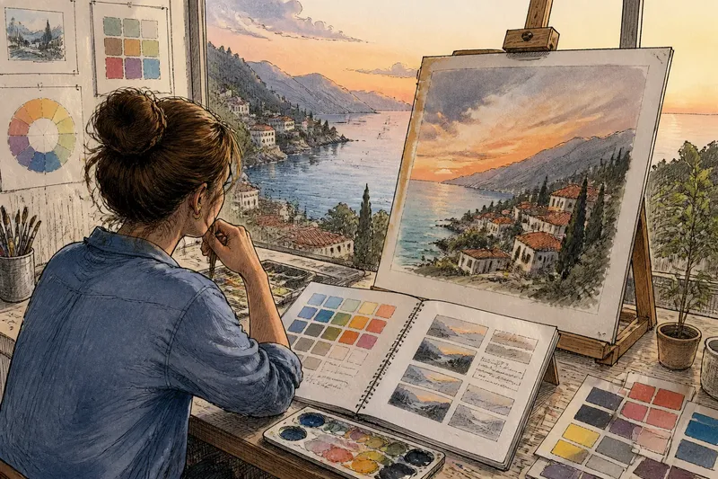
The common mistake in interpreting color is to assign a single emotion to one swatch and stop looking. That shortcut can make an image seem cheerful, ominous, or solemn for reasons its surrounding colors do not support. Color meaning changes with context, contrast, and the palette around it, so start by reading the whole image before naming what one hue “means.”
Why does one color seem to send mixed signals?
A color can carry several familiar associations without delivering all of them at once. Red may suggest warmth, danger, celebration, or embarrassment; the image’s subject and neighboring choices steer which association feels most available. A red scarf in a family portrait does different work from a red warning light, even if the two reds are close.
That does not make color interpretation arbitrary. It means a hue is a visual ingredient, not a message with a fixed translation. Viewers bring learned associations, but the image also supplies clues through its objects, setting, composition, and mood.
When a color feels confusing, write down the first association that comes to mind, then ask what in the image supports it. If the only evidence is the swatch itself, keep the interpretation tentative.
What changes when colors sit beside each other?
Contrast can alter how a hue appears before you even consider what it represents. A muted blue beside bright orange may look cooler and quieter; the same blue beside a gray-green can seem more vivid. The neighboring color becomes part of the first color’s apparent character.
Value matters too. A pale yellow against deep violet may feel luminous, while that yellow against white can look faint or disappear. Saturation—the intensity or purity of a hue—also shifts in comparison: a dusty pink may seem vivid beside beige but restrained beside hot magenta.
These relationships can create a mismatch between an artist’s intention and a viewer’s first impression. Imagine an illustrator choosing a soft green background to make a character feel calm, then placing a saturated red-orange title across it. The strong contrast may draw attention toward alertness or urgency; reducing the title’s intensity or moving it away from the character could let the quieter mood register more clearly.
Look at the pair, not just the individual swatches. A color’s role often becomes clearer when you notice what it makes its neighbors do.
Why can the same palette feel different in another image?
Color associations depend on what the image depicts. A pale blue can suggest open air in a landscape, cool light on a glass of water, or clinical cleanliness on a package. The hue has not changed, but the subject gives viewers a different set of clues.
Composition adds another layer. A small patch of bright yellow may function as a point of attention if the rest of the image is subdued. Spread that yellow across a large area and it can become the image’s dominant atmosphere instead. Placement and proportion help determine whether a hue reads as a detail, an accent, or the main emotional field.
Material and lighting can shift the impression as well. A matte pigment, a reflective surface, and a translucent wash do not present color in the same way. In a digital image, screen settings and surrounding light can change what a viewer sees, so a judgment made from one display may not transfer neatly to another.
Why does a color feel too cheerful, cold, or harsh?
When the mood seems wrong, people often replace the most obvious color immediately. That can help, but it can also miss the real cause: perhaps the hue is too saturated, the contrast is too sharp, or one accent occupies more space than intended.
Separate the variables before changing the palette. Ask whether the problem comes from hue, value, saturation, proportion, or placement. If a blue scene feels cold, warming every blue may flatten its depth; adding a warmer accent or adjusting the light-dark balance could address the impression with less disruption.
A useful first check is to view the image at a smaller size or from farther away. Details recede, and the broad distribution of light and dark becomes easier to notice. If the mood still feels off at that distance, the overall palette or contrast may be doing more work than the individual details.
Change one relationship at a time, then look again at the whole image. That makes it easier to see which adjustment actually changed the impression.
How do you read a palette before assigning meaning?
Start with the image as a whole, not a color wheel or a list of symbolic meanings. Notice the subject, setting, light, and the colors that occupy the largest areas. Then look for accents and contrasts that redirect attention.
- Name the first impression. Write a plain word such as tense, tender, busy, or still. Treat it as an initial response, not a verdict.
- Find the dominant color areas. Notice which hues take up the most space and where they sit in the composition.
- Check light and dark. Look for the brightest and deepest areas; they can shape the image’s weight even when their hues seem quiet.
- Trace the strongest contrasts. Identify the neighboring colors that pull the eye, and notice what subject or detail they emphasize.
- Consider the depicted world. Ask whether the image shows a place, object, or situation that changes the likely association.
- Compare intention with effect. If you know the intended mood, look for the palette choices that support it and those that compete with it.
- Keep more than one reading available. If two interpretations fit the image, describe the clues for each instead of forcing a single answer.
This approach is useful whether you are making an image or discussing one. It replaces “blue means sad” with a more specific observation: “The large, muted blue areas and the isolated warm accent make the scene feel quiet, with a point of tension.”
What should you do when the image’s mood is unclear?
Does a warm color always feel welcoming?
No. Warm hues can also feel aggressive, crowded, or alarming when they are highly saturated, sharply contrasted, or used in a threatening subject. Check what the warm color is emphasizing before treating it as an invitation.
Can a cool palette still feel lively?
Yes. Bright values, strong contrast, and active placement can make cool hues feel energetic. A restrained blue-green palette can also appear vivid if a small, contrasting accent gives the eye a clear point to follow.
Why does a color look different on another screen?
Displays vary in brightness and color rendering, and room light affects what reaches the eye. If an image must be viewed across different screens, avoid basing its entire meaning on a delicate distinction between two neighboring hues.
Should an artist use conventional color symbolism?
Familiar associations can help an image communicate quickly, but they work best as one clue among several. A symbol may be reinforced, complicated, or contradicted by the subject, composition, and surrounding palette.
How can you revise a palette without flattening it?
When a palette does not support the intended effect, avoid changing every color at once. Begin with the relationship that seems most responsible: an accent that dominates, a background that competes, or a contrast that makes the scene feel harsher than intended.
Try a limited adjustment. You might mute one accent, shift its value, or reduce the area it occupies. If the image needs more energy, strengthening a single contrast can be more coherent than increasing saturation across the whole palette.
Keep a copy of the original version so you can compare the overall impression rather than relying on memory. Look at both versions at the same size and in similar lighting; then ask what now attracts your eye first and whether the emotional reading has changed.
For an invented situation, say you are making a poster for a quiet reading room and the first draft feels more festive than restful. The bright coral headline may be overwhelming a soft blue-green field; you could lower its intensity and reduce its visual area, then check whether the room and its central book become the first things viewers notice. The aim is not to remove contrast, but to make its emphasis fit the image.
When should you leave an association unresolved?
Not every image needs to settle into one emotional label. Ambiguity can suit a scene that holds two moods at once: a warm light in a lonely room, or a playful color beside a serious subject. The tension may be the point rather than a palette problem.
Give the image room to support that reading. If viewers can identify the competing clues, uncertainty feels intentional; if the clues seem accidental, a small adjustment to emphasis may help. Ask which parts of the image invite each response before deciding that one must be removed.
The most useful habit is to postpone fixed meaning until you have read the palette as a set of relationships. When you describe color meaning, name the hue, its neighbors, its proportion, and the subject it serves. That fuller description gives you a more accurate interpretation—and a clearer place to begin if you want to change the image.