Why a Blank Margin Changes the Page
A blank margin can make a page easier to read and look at. Learn how to adjust spacing, test the eye’s path, and keep useful details in view.
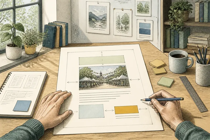
The common mistake with a crowded page is shrinking everything until it fits. That can make a heading, image, or sentence harder to notice, while the blank margin that could organize the page disappears. A blank margin changes the page by giving the eye a clear place to begin and helping nearby elements register.
Adjust the space before revising the content. The goal is not to make every gap meaningful; it is to make the relationships between words, images, and edges easier to read.
Where should you begin with a blank margin?
Start by naming the page’s main job. A poster may need someone to notice an event title, then a date and location. A page of illustrated notes may need a reader to move between a short heading and a diagram. That intended route gives you a basis for deciding which margins need attention.
View the page at its actual size, whether on a screen or as a printout. Look first at its outside edges, then at the space around the most prominent element. If the page feels pressed against the frame, or if you notice an accidental-looking sliver of space, mark that area for revision.
Keep the content in place for now. This isolates spacing as a design choice instead of turning the exercise into a rewrite.
How do you find the eye’s path?
Look at the page briefly, then look away and describe what caught your attention first. Next, trace the order in which you noticed the remaining elements. Note whether the sequence matches the page’s purpose.
Cover one element at a time with a sheet of paper or a movable note. Notice whether the space around it helps a neighboring item stand out or makes that item feel detached. This is useful around a large image, short title, or small caption: each can appear louder or quieter depending on the open area beside it.
Say you have an invented event flyer with a large title, a small illustration, and a date crowded near the lower edge. You move the date inward and leave more open space between it and the illustration. The expected visible result is a clearer separation between the artwork and event details, not a new symbolic meaning for the gap.
How should you adjust the space?
Make one change at a time. Increase or reduce the margin around a single element, then view the whole page again. If you move the title, for instance, leave the illustration and caption in place; otherwise, it is hard to tell which adjustment improved the reading order.
Use alignment as a reference. A line of text can sit flush with an image edge, while a caption can align with the text column rather than the image itself. These relationships make a margin feel intentional even when the amount of space varies across the page.
On a digital layout, guides and rulers can help you compare edges. In a paper mock-up, pencil marks or removable notes let you test positions without committing. Keep the content’s current size while adjusting the surrounding space, then reconsider size only if the page still feels unbalanced.
- Check the outside margin: if text or an image feels pressed against the page edge, move it inward; if the edge already has clear space, leave it in place.
- Check the space around the title: if the heading does not read as the starting point, separate it from nearby material; if it already stands out, keep its spacing.
- Check gaps between related elements: if a label and its image seem disconnected, bring them closer; if they read as a group, preserve the gap.
- Check gaps between unrelated elements: if separate sections run together, add space between them; if the change of subject is already clear, do not widen the gap.
- Check narrow leftover strips: if a strip looks accidental and distracts from the page, reposition an element; if it supports the alignment, keep it.
- Check the page at its intended size: if small text or details are hard to distinguish, adjust their placement or scale; if they remain legible and connected to their subjects, keep the current layout.
What should you check before settling on a layout?
Review the page for specific signs that its spacing is helping or hindering the intended reading order. Check the edge clearance, title separation, related-item groupings, and leftover gaps at the size where the page will be viewed. If any check reveals confusion, make one targeted adjustment; if the intended route is clear, leave that relationship unchanged.
How much blank margin is enough?
There is no single amount that suits every page. Keep adding or removing space until the intended order is apparent without making related items feel separated.
Should every empty gap have a meaning?
No. Some space is simply room between elements, and that is useful on its own. Treat a gap as part of the design when it affects grouping, emphasis, or the route a reader follows.
What if the page still feels crowded?
Check whether too many elements are competing for attention rather than assuming the margins alone are at fault. Remove, shorten, or simplify material only if it is not needed for the page’s purpose.
Can margins vary across one page?
Yes, if the variation supports the layout’s relationships. A title may need more open space than a caption, while repeated sections may benefit from consistent spacing that helps readers compare them.
How can you judge the page at a glance?
Step back from a printed page or reduce the zoom on a screen until the details soften. At that scale, ask whether the main element still stands out and whether the page divides into clear groups. Then return to normal size and check that captions, small labels, and other supporting details remain close enough to their subjects.
Inspect the edges as well as the center. A generous central opening will not help if a title nearly touches the top edge or an image seems to slip off one side. Look at the page as a whole, then make the smallest adjustment that resolves the specific distraction.
When you revise a blank margin, keep the content’s purpose in view: space should clarify what belongs together, what deserves attention, and where the eye can rest. A useful final check is to ask a reader what they noticed first and what they looked at next; if that sequence matches your intention, the page has room to do its work.